
Initial Ideas

After the initial project launch and lectures, I jotted down some inital ideas around the project brief of ‘Poetic Science’. This module really interests me as I’d love to learn and practise some different methods of making, particularly printmaking. My initial idea is to focus on topics of paradigm shifts, parallel universes and transformation. I’d like to create a narrative that lends itself to these themes and create a publication. I think that this idea of changing perspectives and alternate universes aligns with an interesting form of storytelling, where I can bend the story and suggest alternate paths not only within the narrative/illustrations but in the form of the book itself, kinda like a sort of artist book. Maybe even reflecting the paradigm shifts of the story in the different print and process mediums throughout the book.
Tutorial Notes and Thoughts

First tutorial with Jonathan, he suggested to find a narrative that fits the theme of paradigm shifts and use that as my subject matter, as apposed to creating my own story, in order to save time. He suggested the book Exercises in Style, where the same story is retold 99 times through different perspectives, although I doubt I will use the story from that book I might use this idea of retelling the same story through different lenses. Maybe with a fairytale or some folklore story that aligns more with my interests. We spoke about artists books and making some examples by playing with paper, creating folds to think about different surfaces and how I reveal different realities.

Here are some notes based around my current ideas, thinking of using the boy who cried wolf as my narrative inspo and just brain-dumping some rough ideas of different narrative paths that I could take. My current priority is finding a narrative/ or narratives that work well with my concepts so I can begin planning layouts and storyboarding.

Tutorial with Chris, discussing different artists books to research and looking at influences to aid my decision making when it comes to creating/selecting a narrative.
Paper Experiments
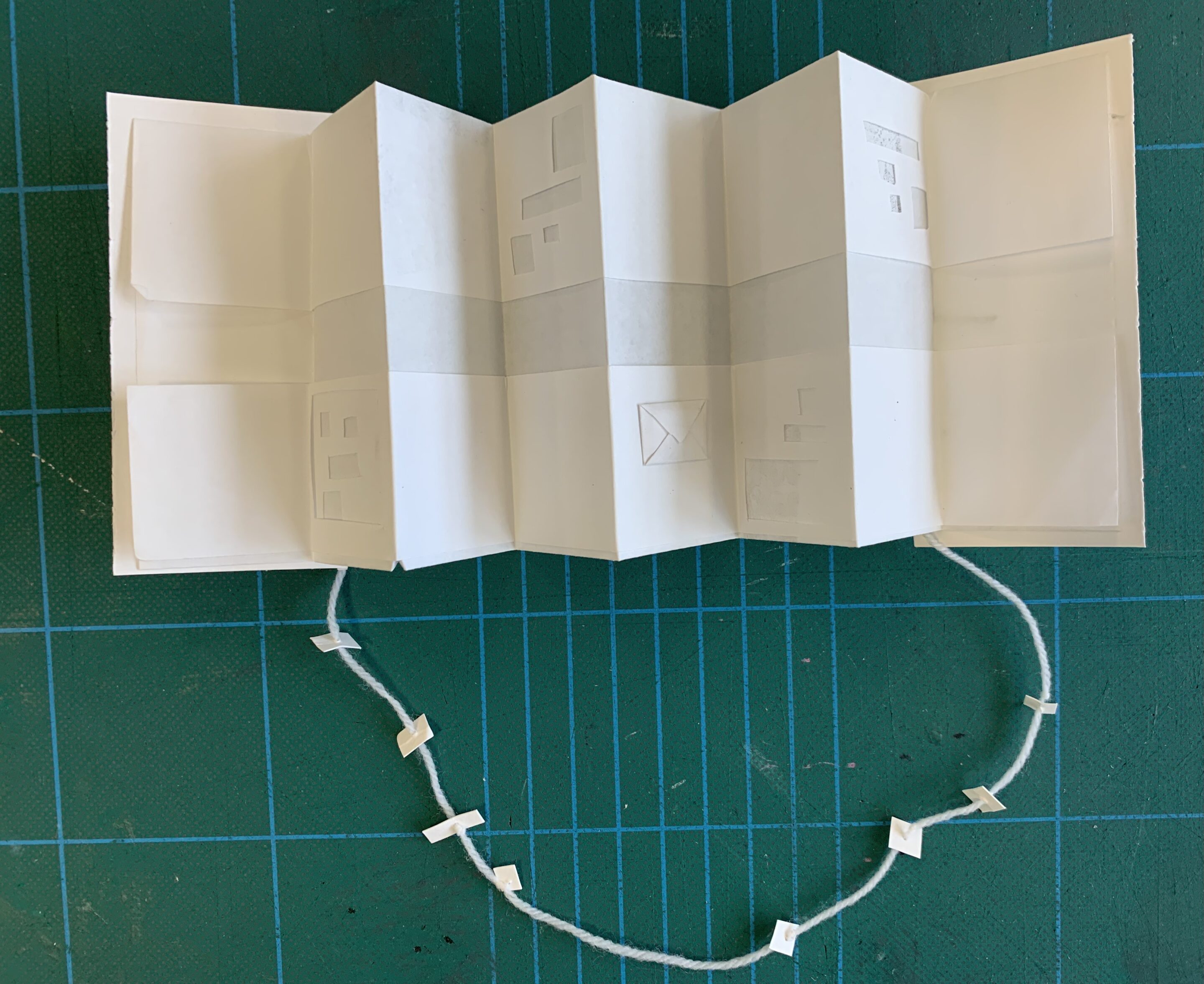


Accordian style fold with beaded string spine and little windows and fold outs to reveal different narratives concealed in the paper, I like the idea of these little envelopes with mini zines or text within. Zine-ception!

Little pamphlet book with illustrative cut out pages and windows to add depth and interaction to the story.
Accordian doors revealing more folds within, could use the x,y plains to tell different stories that all meet in the middle/ begin at the same point.
Chaos layout to match my chaos thinking, each fold reveals different realities of the narrative.
Loving this little box fold experiment, would make printing easier if all the pages were square also

The box fold creates this star shape when the edges are held together, creating another possible surface for illustration.
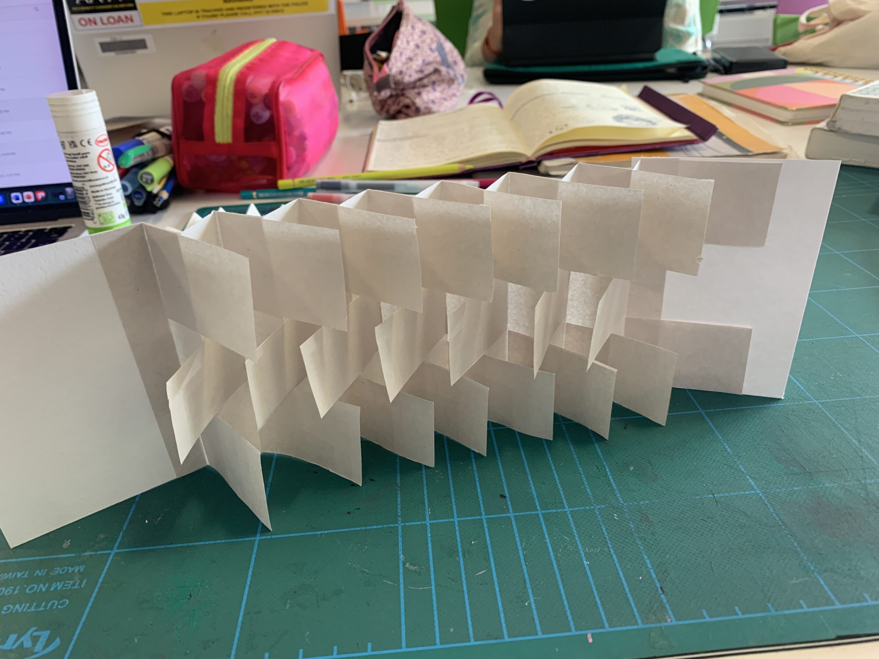

Accordian style flag book made with instructions from the book ‘The Art of the Fold’, thinkingh this would work well with an illustrated sequence.
A ‘Victorian love letter’ fold experiment
I created this very sketchy fliporello zine using some rough storyboard I sketched out, made lots of mistakes with the order and overcropped the imagery so you cant read the words but I like the concept if it was much neater.
Research
Animal Archetypes
After some discussions with tutors I have decided to base my narrative on animal archetypes and using folklore storytelling as an inspo point to inform my own narrative and storytelling. I am inspired by the book The Women Who Run With Wolves by Clarissa Pinkola Estes, where she dissects folklore stories and analylises the different psychological archetypes represented in different creatures or characters in the fairytales. I aim to research different animal archetypes as a subject matter to draw from when creating my stories. I still wish to follow the theme of parallel universes through this lense, by creating a series of zines that tell different stories from different perspectives.
Wolves

In Native American folklore, the white wolf is seen as a powerful symbol, often bringing messages from the spirit world. The white wolf is seen as a sort fo guardian which represents freedom and wisdom. Wolves are common characters in Native American storytelling, contrary to european folklore where wolves are depicted as dangerous, wolves represent intuition and wild nature, often seen as protective. The solidarity of the wolf pack is mirrored in the solidarity of the tribe.

In The Women Who Run With the Wolves, Clarissa Pinkola Estes retells a myriad of folklore stories and dissects them based on the different archetypes that the different characters represent. The wolf is heavily mentioned throughout the book where she relates the strong intuitive nature of the wolf to that of the human woman. Estes mentions the story of ‘La Loba’ or the wolf woman(pg26-28), where the woman ressurects creatures, especially wolves, from their bones. The story represents the self preservation and rebirth of the wild parts of ones own mind.

Werewolves are often depicted in fiction such as The White Wolf of the Hartz Mountains, which features a demonic femme fatale white werewolf, or comics like Adventures into Darkness with its vintage horror artworks. as well as modern fiction, werewolves are seen in ancient folklore, often representing transformtion and the animalistic nature within humans. Werewolf mythology is associated with the witch trials of the Middle Ages, where sucpision of witches and werewolves developed into witch hunts and public excecutions.
Deer


In Princess Mononoke, the spirit of the forest is visualised as a deer creature with god like tendancies. This deer depcition symbolises an ethereal god of nature, at first seemingly innocent and then suprisingly powerful.

Sika Deer are considered sacred and divine in Nara Park, Japan. According to folklore, the deer were considered sacred after a visit from a sword god diety who rode on a white deer. Killing one of these deer was considered a capital offence. The Sika Deer that are enclosed in Nara park have inherited and maintained DNA from ancient species of deer due to their restricted gene pool.

Cernunnous is an ancient Celtic diety, “The Lord of the Wild Things”, he symbolises the forest, fertility, wild nature and regeneration. He is visualised as crosslegged with stag antlers on his head. Some people say he is the predeccesor of the Celtic Green Man.
Seals/Selkie Folklore

Song of the Sea is based of irish folklore, where younger sister Saoirse is the last seal child and sets off on a massion to save the world of magic.

Selkie folklore stems from norse and celtic mythology, many islands off scotland have stories of seals shedding their skin and walking on land- becoming beautiful humans, often women.

In the film adaption of the book The Outrun, Rona attempts to overcome her adddiction and troubled past and moves from London to the Orkney Islands where nature and folklore inspire her to change and grow. There are many scenes including seals and their impact on Rona and her journery of self discovery.
Artist Books
Julie Chen's Flying Fish Press


Julie Chen’s artist books are a wonderful example of interesting and unique book forms, her book ‘Chrysalis’ is an interpretation of the transformative process of grief, the topic of transformation is mirrored in the form of a chrysalis linking to metamorphosis. The book is held together with magnets to create this intricate natural form.


In both ‘Many Hands'(above) and ‘The Accretion of Identity’ (left) Chen uses this boxy form that, when opened, reveals layers and smaller book/paper pieces inside. Her work is incredibly precise and clean looking. I love the use of origami forms within the covers.
Kveta Pacovska

Kveta Pacovska’s books have a sophisticated yet playful aesthetic. I really like the pop ups, cut outs and tactile paper embossing paired with fun colour schemes and character design.


Chris Ware's Building Stories
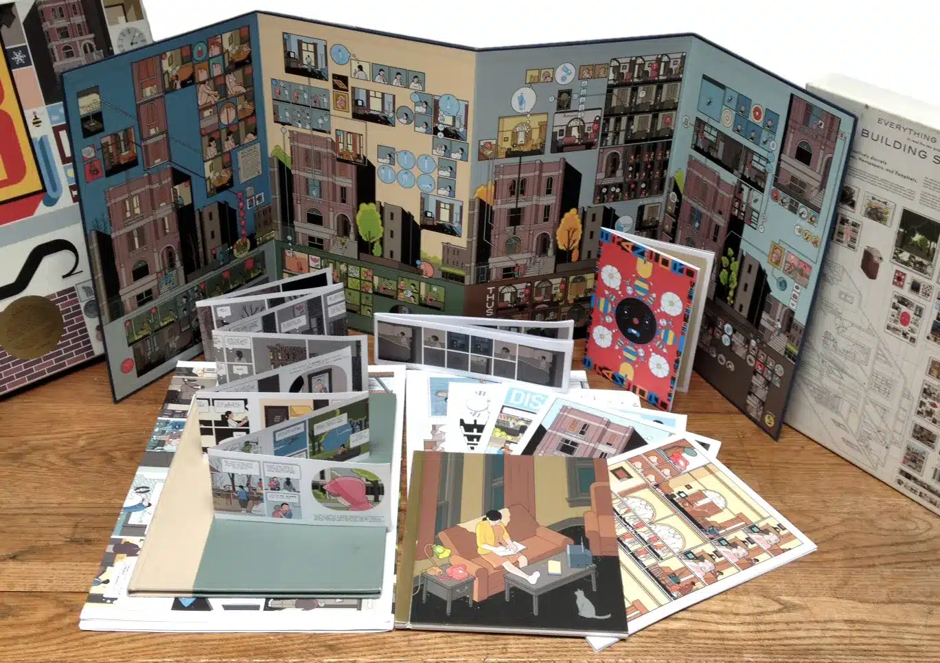
I really love how “Building Stories” creates a sort of board game of illustrated storytelling. I like how the pages and content aren’t refined to one piece or book. It reminds me of a diorama science project, displying all sorts of information as a kind of puzzle. I think this sort of layout insoires my slightly chaotic thinking and could showcase a variety of processes and ideas.
Developing Ideas


At this stage I am developing my ideas into a sort of rough plan, thinking about creating an artist book with a selection of zines and using different materials to create an interchangable story and different characters to reflect the animal archetypes as well as the changing perspectives and paradigm shifts- linking to my main topic themes.


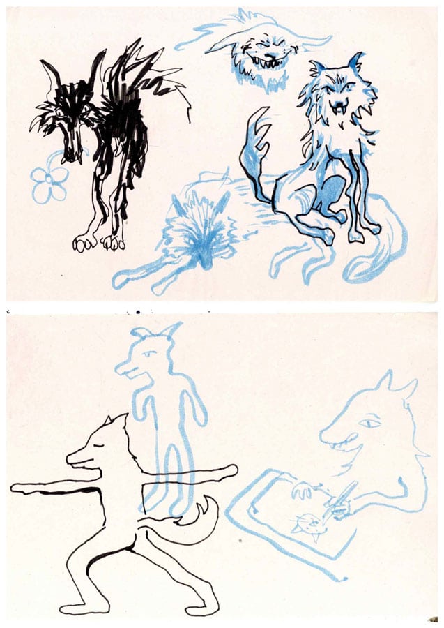
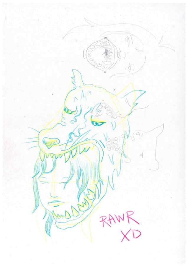
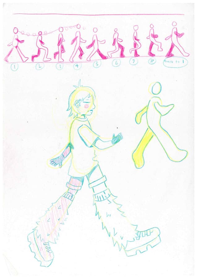
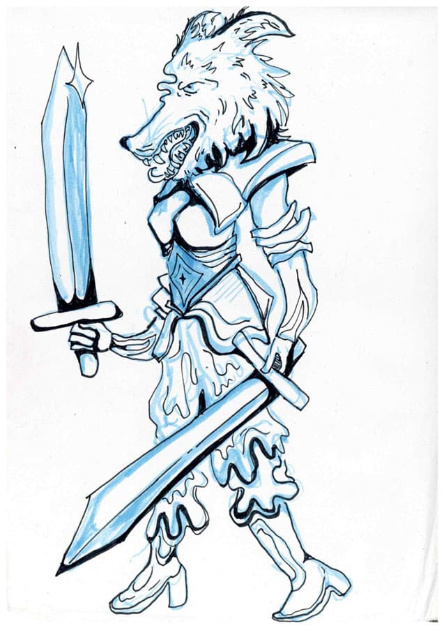
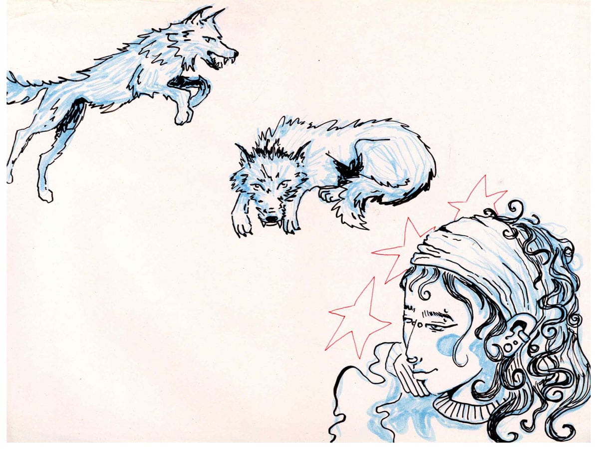
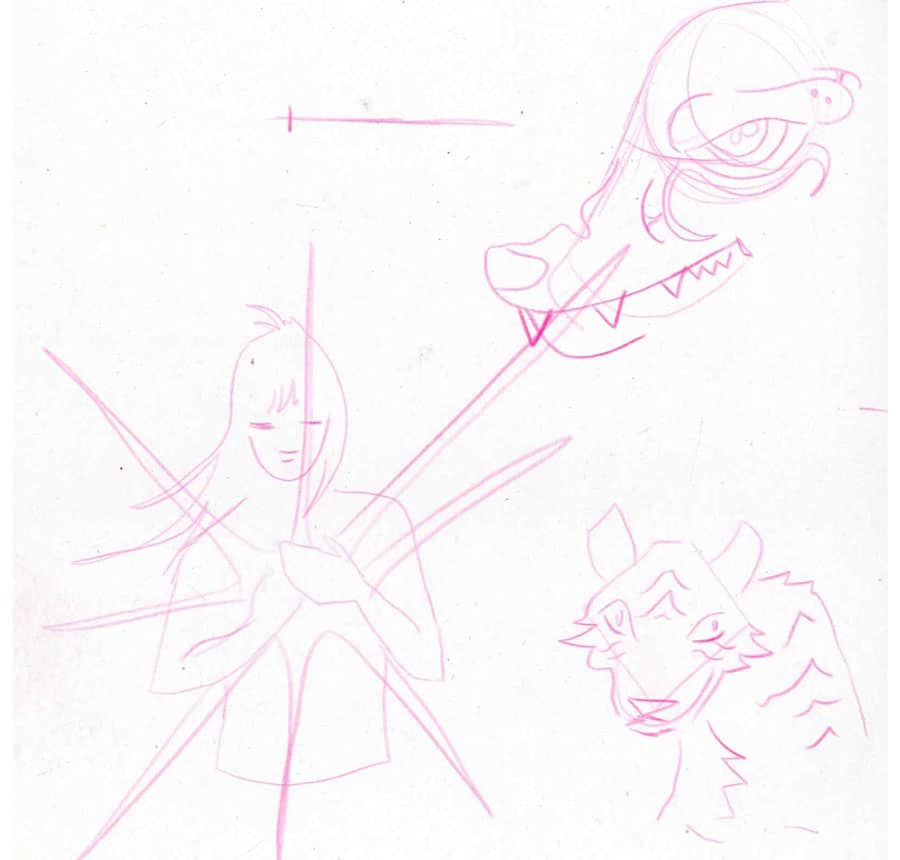
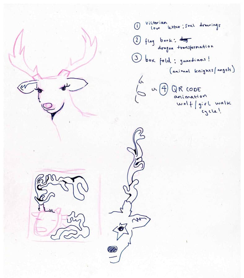
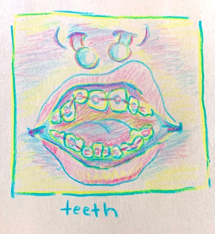
As the project is picking up i am living my life by lists and notes and doing lots of rough sketches when i can
img20260112_11230152
img20260112_11223514
img20260112_11214615
img20260112_11204898
img20260112_11235382
img20260112_11232754.jpg2
img20260112_11232754
img20260112_11243875

img20260112_11134760

img20260112_11114359
img20260112_11121316
img20260112_11123442
img20260112_11132655
img20260112_11100778

IMG_2690-3
IMG_2689-3
img20260112_11221381

IMG_2691-3

img20260112_11144462

img20260112_11080786


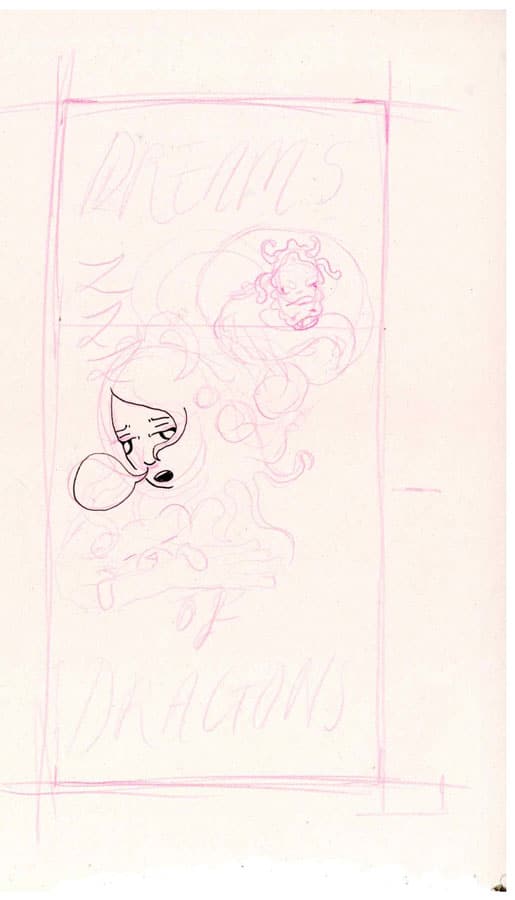
Refining my design and thinking about how the final piece is going to turn out, thinking about the cover design and the contents.
Processes
Rubber Stamps

Rubber stamp making was a super fun and easy process, i would love to make a font from rubber stamp letters. basically a tiny linocut 🙂


Embossing

I was happy with my outcome from the embossing induction and would have loved to include this in my final outcome however I never got round to it but it’s something i will consider for future projects.
Wood Engraving

Sketching my design and transfering it to the wood block.

engraving my design


my engraved design before printing. My finshed print of the left, I am happy with the result and in like the wolf girl design however i dont think wood engraving is very accesible to me as its extremely expensive. would be interested in trying woodcut print as a cheaper alternative.
Ceramics and glazing


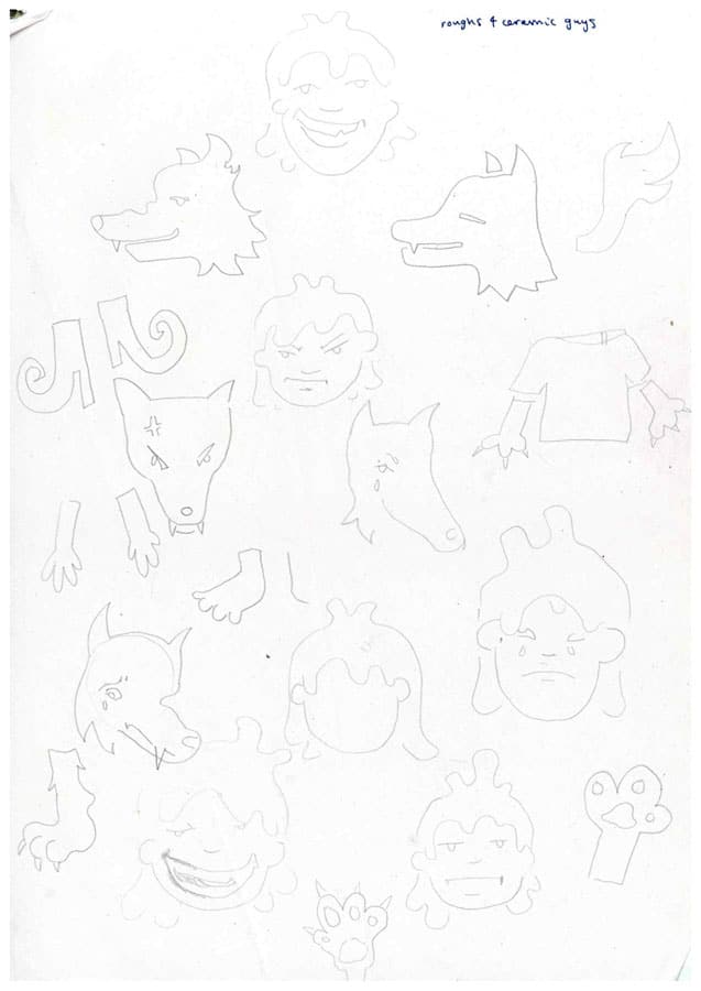
^ Some rough designs ^

Here I am creating little ceramic character parts which i plan to add magnets to the back of and will eventually come together in the artist book as a build-your-own-character section. I am using earthenware clay and painting a selection of coloured decorative slips and sgraffito-ing my designs into the character shapes.

Here they are leather hard and waiting to dry to a bonedry level so they can be bisque fired before glazing.


Here are the pieces after a clear glazing- i really like the sgraffito illustrative effect but not loving the colours. Some of the green and yellow pieces dont contrast well with the white ceramic and the illustrations are hard to see, also i dont love the colour pallet and some of the glaze cracked during firing. after discussing my outcome with some of the tutors in fabrication, Paul suggested that i try enamelling as an alternative as it is a quicker process (firing takes only a few minutes) and i can use the same sgraffito method to get fine details.
Riso printing and CMYK separations

yellow

magenta

cyan
For a riso support session with Jackson, I had prepared an image into the different CMYK sperations, leaving out the black as the image didnt really have any black. I added halftones as i like the style it gives. i am using a painting i did as a comission over summer as it has lots of vibrant colours, just as a test to get myself familiar with digital formatting and using the riso printer.

orignal artwork

cyan, yellow and magenta print

magenta and cyan print
I am happy with the outcome although the full colour print is a bit muddy, and i prefer the blue and pink version. I do feel more confident with riso and have learnt how to print artwork from a computer as apposed to scanning in images.


here i am learning to colour linework digitally using photoshop, i think this will create a crisper-coloured risoprint compared to a painting as it lacks that muddiness and also saves time whilst colouring. Still using unrelated artwork for these tests just using random bits from personal sketchbooks.

cyan

magenta

yellow

black


really loving these outcomes and the different colour combinations that i can create using the different colour layers. i feel like i am getting the hang of digital colouring and riso printing, which is really exciting as I’ve been meaning to wrap my head around these processes for a while now.
Enamel


This is my outcome for my first enamel induction. I really fell in love with this process, and i think it works well with my style. here i used wet enamel to coat the copper and then sgraffito-ed the design into it before firing, i really love the outcome but i wanted to try multiple processes so i sived this blue enamel powder over a stencil to colour some areas and i kinda hate this outcome, i think the blue kind of ruined it.


Here I started cutting smaller pieces in a thinner copper, sanding the sides and all the sharp edges, wet enameling the back and firing, then wet enamel the front and sgraffito into it once dry. This was a fairly long process and quite tedious but extremely rewarding. It took me a while to figure out the right consistency for the enamel, as when its too thick the design gets hidden by the overflowing enamel as you can see in some of the pieces on the right.

I really loved this process and started making pieces in batches, cutting out designs based off of drawings in my sketchbook.

firing the wet enamel on the backs then drying the enamel ready for sgraffito.

really exciting seeing the characters come together.

Quickly decided to create my poetry magnets from the enamel, measuring this a4 sheet into strips

writing the words on the copper strips and then cutting these out with metal shears

lots of words to process…

Getting very excited by the poem possibilites, trying to link the worlds to the whole animalistic theme.

some pieces before firing- adding lots of symbols and the letter s to make plurals

Really enjoying the slight aesthetic inconsistency between the different firings. some are darker and some lighter.

friends coming to play with the words and creating new poems.

a poem that Honey made whilst i was working, exciting to see engagment already 🙂

some troubleshooting with a few pieces where i didnt sand the copper enough for the enamel to stick and didnt fire long enough, had plenty of copper to work with so was no issue with a few failed pieces.

Adding little magnets to the backs of the enamel pieces with UHU Universal Glue, took a while to dry and had over 200 enamel pieces to stick magnets to, this took a while but heres some of them up on my fridge at home. Getting some good feedback from vistors and housemates as they’ve been stored on display on my fridge. really loving the interactivity of this project so far, very excited for the final outcome. next step is creating the big board to house the comics and all the magnetic enamel pieces. I bought some magnetic paper online but its not strong enough to hold the copper enamel pieces so i will have to cut out some steel sheets to fit inside the book.
digital colouring + image refining


here are some rough designs for the cover of my folding book case, inspired by the comparison between wolves and humans in folklore and “The Women Who Run With Wolves”. i plan to screen print these so they need refining and digitalising.

Refined linework ready for digitalising and colouring on Photoshop.


drawing a border and trying to incorperate a title into it.

This was my inital attempt at colouring, really hated it if i’m honest, dont think the colours work at all, its much too loud and the background is much too lively. the resolution went wront when uploading it to this blog and i dont even want to show it in a higher quality beacause its so ugly. started from scratch and chose a more refined colour pallet and decided on dark blue linework apposed to black, to tie all the colours together. I am fairly happy with the result, i like the colours a lot and the border is super nice. I’m not super proud of the illustrations themselves and the placement kinda bothers me but I think at this point i am running out of time so can’t really re-do the whole artwork.


Victorian Love Letter/ animal soul Zine

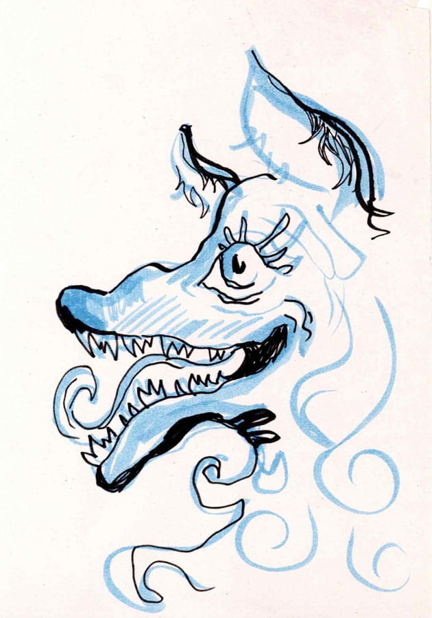
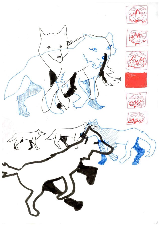
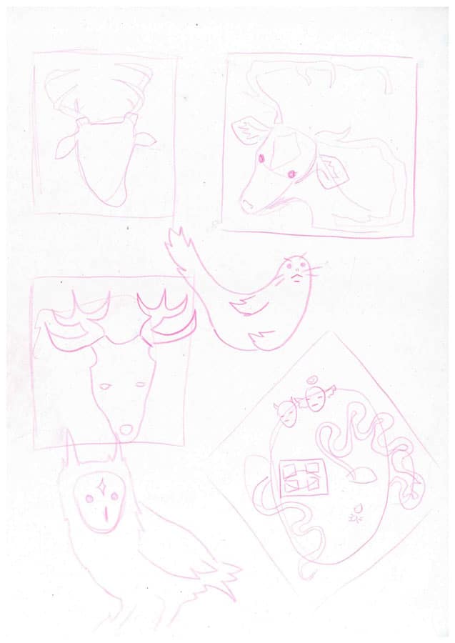
inital drawing informed by some animals I previously sketched, selecting the animals based on four traits: wild, wise, sensitive and pure.

creating a layout using photoshop guides and printing this off to trace guides onto my drawing as the images must fit within the folds. using a pink pencil to sketch and a black fineliner with archival ink for the linework.


front and back digitally coloured, ready for CMYK seperation and riso printing.


Printing out the front design and folding it up to figure out the placement on the back of the zine. To the right is my Photoshop layout guide that i used to trace the image placements.


Also created my own font using calligraphr, quite happy with the result and have used this font throughout this project. Here is the finished fold after being risoprinted, kinda prefer the pink and black version apposed to the yellow pink and black as the yellow and black dont really look great together, however the yellow pink gradient is quite lovely and translates well from the digital colouring. bit of an issue with paper selection, as the thinner paper (90gsm) folds better but is too transparent for the black line work and sometimes bleeds through, but the thicker paper (180gsm) is too thick for the fold to sit nicely. I did try different methods but neither are perfect. Overall super ahppy with the design and fold, I think the fold reveals the artworls in a really interesting way and i like how i incorperated text on the folding wings.
Fierce and Femme Wolf Zine

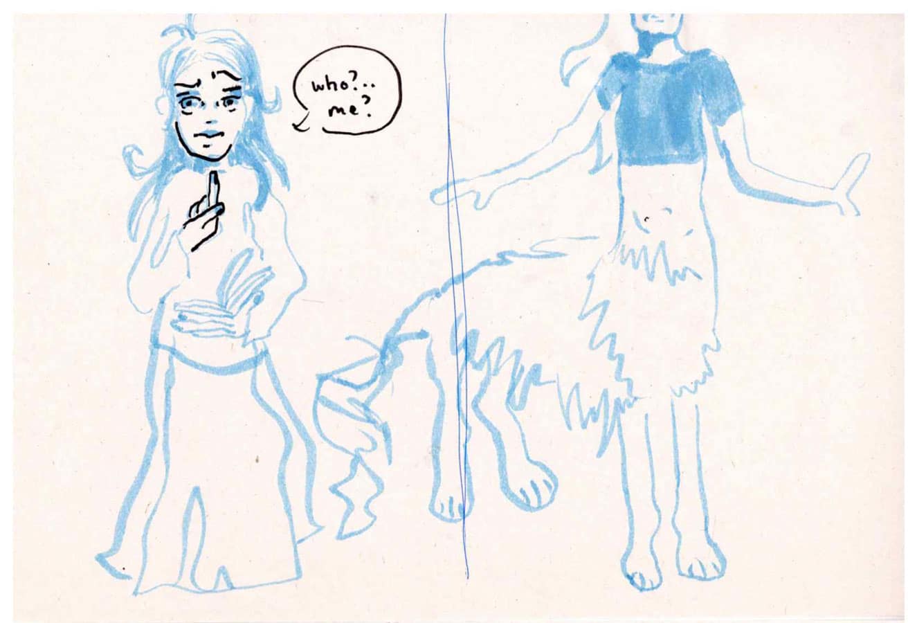
i based this zine of the drawing on the right, i wanted to capture the feeling of dehumanisation within self doubt, but with a bit of self acceptance at the end. i wrote this comic in my notes app before bed. Rough sketch above ^


Sketching in pink pencil and drawing linework in ink, leaving space for text.


Digital colours and text added.


Scanned risoprints and finished comic. super happy with the result, really getting a hand of digital colouring and risoprinting, didn’t halftone the image this time and i’m super happy with the result, the colours are lovely and the gradients work super well with the two tone colour pallette.
Flag book zine and animation

This drawing^ is the literal definition of make it exist first, make it good later. Attempting to create this dragon girl morph sequence, one as a close up of the face, and another as a girl sleeping and morphing into a dragon in her dream. Kinda ambitious to complete all this as an animation and a phyical book but I am Capable!!!


On the left is my super professional hand drawn animation setup… using a4 tracing paper cut into quarters and drawing the first frame on newsprint, then just intuitively drawing each frame until i reach the dragon version.

Think I’m getting the hnag of this hand drawn animation stuff, I feel like it comes pretty naturally at this point.

Riso printing the individual frames ready to become part of the flag book.

Consulting the bible (the art of the fold) when compiling my pieces together into the accordion flag book

compling my first prototype.

Prototype one has a few issues, the accordian part is too thick so the book doesnt close and the covers are too thin.

Second prototype has better structure, i used translucent paper for the accordian and it makes a nice crinkly noise when opened and the frames sit nicely on it and close easily. i also added greyboard covers for structure and it works very nicely. Library folded the newsprint cover onto the greyboard… not sure if this is an ok thing to do but whatever works at this point.


For the next prototype, I had the idea of risoprinting onto transparent paper so you can see through the frames of the flagbook, similar to my drawing process using tracing paper. howver riso inks wont dry on plastic tracing paper. after a conversation with jackson and some reddit research, i decided to attempt printing on 80gsm vellum paper, made from cottion so the riso inks will dry and just thick enough to go through the printer. This was the most frustrating thing to print and i kept having to peel this expensive vellum off the ink drums as it kept jamming. maybe 3 out of every 10 prints actually worked but the ones that were successful were pretty incredible and i loved the seethrough effect. compiling the flagbook with them was a bit tricky and the transparent paper kinds warped with the glue, might be better to have sent this through the print bureau on a thicker acetate paper prehaps.
Binding the board and compiling the final piece


here i am compiling the fabric cover, grey board and steel sheets into a big board game-esque arttist book. had to take nover my whole kitchen for this one, i attached the greyboard to the steel with the ol trusty UHU universal glue and then library folded the fabric cover over the corners beofre adding the third and final greyboard to the middle piece.

My inital plan was to screen print the cover but i ran out of time so i opted for printing on canvas through the print bureau, here are some of my workings out to get the meaurements right whilst formatting my file. leaving folding room and room for the extra fabric to go around the edges, i think i did this quite well but shoulve gven more space for folding as the board only shuts one way and doesnt really sit too flat.

used this blue coloured paper for the interior, with pink strips along the folds for flexibility and extra strength along the weaker parts. Used a foam roller and archival glue for all the paper to keep it even and strong.


Managed to fold the fabric onto the board fairly neat, and my meaurements were mostly correct when cutting the greyboard and steel sheets. getting excited seeing it all come together with the magnetic enamel pieces attatching easily. Starting to fold these little pockets for the comics.

Here are the pockets all finished with the zines inside, measured the pocktes to fit each zine individually and i am really happy with the results. The zines all look really nice and i am finally feeling like everything is coming together.

evaluation
For my second-year illustration project Process and Practice, I explored animal archetypes and changing perspectives. Initially, choosing a topic was challenging, as I struggled to decide on a clear direction. However, through research and experimentation, I gradually gravitated towards animal archetypes as a way of examining symbolism, identity and shifting viewpoints. This decision allowed me to engage with poetic science through both narrative and visual interpretation, blending observation with imagination.
Throughout this project, I pushed myself significantly and produced far more work than I initially expected. This included comics, enamel work, animations and interactive elements, all of which allowed me to explore the theme across different formats. I feel this body of work demonstrates a wide range of my skills and interests, and reflects a strong level of commitment to the project.
A major strength of this project was the development of my technical skills. I particularly enjoyed becoming more confident with practical processes such as enamel work and risograph printing. Learning to work with riso printing was especially valuable, as it encouraged me to embrace imperfections and experiment with colour layering and texture. Alongside this, I expanded my digital skills and now feel fully confident in creating and preparing artwork digitally for print. Risograph printing is a process I feel I can continue to develop and potentially excel in during future projects.
I am pleased with the final outcome, especially the interactive nature of the piece. The use of magnets, alongside printed and animated elements, invites the audience to engage with the work in a tactile and playful way. Although the overall outcome may appear somewhat messy, I feel this reflects the exploratory nature of the project and aligns with the idea of process and practise.
If I were to revisit this project, there are several improvements I would make. I would have liked to create a custom box for the magnets to enhance presentation, rather than using a temporary solution due to time constraints. I also would have loved to screen print the fabric cover but was unable to do so within the timeframe. Additionally, I think I would have benefited from a consultation regarding the binding of my final book board. Overall, however, I am proud of what I achieved and feel this project successfully showcases both my creative range and technical development.